DEVICE/BROWSER INFO
aatventure


Media queries to help designers & developers save some time searching. I'll try to continue adding as much media queries as possible.
@media only screen
  and (min-device-width : 768px)
  and (max-device-width : 1024px) {
/* STYLES GO HERE */
}
@media only screen
  and (min-device-width : 768px)
  and (max-device-width : 1024px)
  and (orientation : portrait) {
/* STYLES GO HERE */
}
@media only screen
  and (min-device-width : 768px)
  and (max-device-width : 1024px)
  and (orientation : landscape) {
/* STYLES GO HERE */
}
@media only screen
  and (min-device-width : 375px)
  and (max-device-width : 812px)
  and (-webkit-device-pixel-ratio : 3) {
/* STYLES GO HERE */
}
@media only screen
  and (min-device-width : 375px)
  and (max-device-width : 812px)
  and (-webkit-device-pixel-ratio : 3)
  and (orientation : portrait) {
/* STYLES GO HERE */
}
@media only screen
  and (min-device-width : 375px)
  and (max-device-width : 812px)
  and (-webkit-device-pixel-ratio : 3)
  and (orientation : landscape) {
/* STYLES GO HERE */
}
@media only screen
  and (min-device-width: 320px)
  and (max-device-width: 480px) {
/* STYLES GO HERE */
}
@media only screen
  and (min-device-width: 320px)
  and (max-device-width: 480px)
  and (orientation : portrait) {
/* STYLES GO HERE */
}
@media only screen
  and (min-device-width: 320px)
  and (max-device-width: 480px)
  and (orientation : landscape) {
/* STYLES GO HERE */
}

Who Do You Want To Be Today?
 Batman
 Superman
 Spider Man
 James Bond
 Einstein
 Donald Trump
 Elon Musk
 Jeff Bezos
 Abba
Abba
 Queen
Queen
 The Police
 Rammstein
 Plaza Exotica
 Pizzeria
 Sushi Resto
 Slagerij


 Web Dev Simplified
1 year ago
Web Dev Simplified
1 year ago
 Web Dev Simplified
1 year ago
Web Dev Simplified
1 year ago


 Google Chrome
1 year ago
Google Chrome
1 year ago

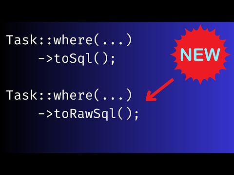
 Laravel Daily
1 year ago
Laravel Daily
1 year ago


 JavaScript Mastery
2 years ago
JavaScript Mastery
2 years ago

 Google Chrome
2 years ago
Google Chrome
2 years ago
 Google Chrome
2 years ago
Google Chrome
2 years ago
 Web Dev Simplified
2 years ago
Web Dev Simplified
2 years ago


 Web Dev Simplified
3 years ago
Web Dev Simplified
3 years ago


 Kevin Powell
3 years ago
Kevin Powell
3 years ago


